日本語-Englishー台灣華語
アンリ・マティス
ブルー・ヌードⅡ
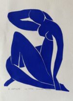
Blue Nude Ⅱ
藍色裸體II
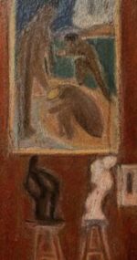
The Red Studio
紅色工作室
絵といい女性といい、ピカソが心底ライバル視していたのが、マティスである。そのマティスのデッサンが、熱海の海岸沿いにある明治の洋館を移築したレストランに飾ってあった。とても似合っていた。マティスの絵がそこにあると華やいだ感じになる。それも上品に華やぐ。気を滅入らせることのない主題、洗練されたフォルム、調和のとれた色彩。マティスは人々の疲れを癒す良い肘掛け椅子のような芸術を目指したいと言っているが、本当だ。マティスの絵は時に巧いのか下手なのかわからないことがあるが、実際に描いてみると難しい。マティスの絵は薄塗りで構図が単純に見えるが、実は何度も絵の具を拭って描き直された末に出来上がっている。描き直した複数の痕跡と、絵筆のスピードに秘密があるらしい。とにかくいつも挫折する。
マティスはピカソと異なり、初めから画家を目指していた訳ではない。入院を契機に法律家から画家に転進した。ましてマティスは初めから革新的な絵を目指していた訳ではない。モローに師事し、過去の巨匠たちの作品を徹底的に模写することから初めたのである。モローはマティスの天賦の才を見抜き、「君は絵を単純化するために生まれてきた」と言ったと伝えられているが、やがてマティスの模写は自由な解釈を始める。 マティスは最も影響を受けた画家は誰かと問われて、迷わずポール・セザンヌと答えている。マティスは少ない稼ぎを貯めてセザンヌの絵を買い、画家としての心の支えにしていたと言う。マティスはゴーギャンから色彩の解放を学び取り、自由な色を選ぶようになる。
絵画が平面芸術であることを強調し追求していったマティスは、切り絵に辿り着く。彼が切り絵をはじめたのは、これまた入院がきっかけである。マティスは自身の切り絵を評して「切り絵ははさみを使って線描する、色彩の中を直に切り抜く彫刻家の直彫りである」と語っている。マティスにとって色彩は感情の表れである。色を変えた時には新たな釣り合いをとるために形も変えざるを得なくなる。マティスにとって画面の構成とは、画家の感情を装飾的なやり方で組み合わせる技術である。だから形と色彩が一体となった切り絵は、マティスにとって最も単純で、直接的で、効率的な手法なのだ。
私はマティスが辿り着いた極意から遡って、画家の軌跡をたどることにした。単色のブルー・ヌードからはじめることにした。切り絵はあらかじめグアッシュで着色した紙を切るだけなので簡単だと思っていたが、いざ制作をはじめてみると、色と形が渾然一体となっているところにマティスの精神が宿っていることを思い知る。形の方はマティスが既に決めてくれているので気が楽なのだが、この青が問題だった。以前切り絵の本物を観た記憶では、特殊な青を使ったようには見えなかった。似せた色をいろいろ模索するのだが、どうしても普通の青ではしっくりとこない。そこで以前買っておいたイブ・クラインのブルーの粉末(インターナショナル・クライン・ブルー)を使うことにした。イブ・クラインの作品はそれまで実物を見たことがなかったが、バブル期に西麻布にできたイタリアン・レストランにイブ・クラインのヴィーナスが置いてあった。それまで何の興味もなかったイブ・クラインだったが、その青は心に染み入る特別な色だった。ところがこの顔料は、やたらと粒子が細かく、水に溶かして描いても乾くとパサパサになって飛び散り始末に負えない。イブ・クラインは特殊な定着液を使っていたということだが、巧く画面に定着しない。フキサチーフやら油やらニスやら、いろいろ失敗しながら何とかねじ伏せてやっと青い紙を作った。ブルー・ヌードを製作する青い紙が得られたのでマティスの形を切り抜くと、これがしっくりとくる。マティスの本当の色がどうであれ、私にとっては形と色がしっくりいくことが重要である。
マティスのブルー・ヌードを実際切って制作してみると、手足や首、胸などが微妙にくっ付いていたり離れていたりするのが、とても気になってくる。切り込みの空いている幅が貼り付けた時、微妙に重要である。間を空けすぎると全体の雰囲気が壊れ、狭め過ぎると伸びやかさがなくなる。胸の切り込みなどは、そこが失敗すると他がどんなによく出来ても台無しになる。 切り絵を実際に制作しみて、マティスの絵を私が何度やっても巧く描けなかった理由が実感としてわかってきた。一つ一つの線の太さや長さ、それに形の微妙な歪みがマティスにおいてはとりわけ重要なのだ。それが少しでもずれると雰囲気を壊すのである。ましてそれに色が加わるのだから、案外と難しい訳だ。
ブルー・ヌードを日々眺めていると、その揺るぎない構成を強く感じることができる。画集で観ているだけではわからないが、サイズを変えていくつか制作してみると、ブルー・ヌードは小さくても十分な力を発揮することが実感できる。一度完成できると急にマティスが身近に感じられる。色彩とフォルムは純化される程、完成度が求められるのである。
Blue Nude Ⅱ
In terms of both paintings and women, Picasso deeply considered Matisse as his rival. Matisse’s drawings were displayed in a restaurant that had been relocated to a Western style building from the Meiji era along the Atami coast. They matched the setting very well. The presence of Matisse’s paintings adds a lively yet elegant feel. They enliven the atmosphere in a refined way. With themes that don’t depress, sophisticated forms, and harmonious colors. Matisse has said he aimed to create art that serves as a good armchair, offering rest for the weary, and it’s true. Sometimes it’s hard to tell if Matisse’s paintings are skillful or not, but trying to replicate them reveals their complexity. His paintings may look like they have simple compositions with thin layers of paint, but they are the result of repeatedly wiping away and redoing the paint. It seems the secret lies in the traces of these revisions and the speed of the brush strokes. In any case, I always end up feeling frustrated. Unlike Picasso, Matisse didn’t initially set out to be a painter. It was his hospitalization that shifted his path from law to painting. Moreover, Matisse didn’t start with the aim of creating innovative paintings. He began by thoroughly copying the works of past masters under the guidance of Moreau. Moreau recognized Matisse’s innate talent and is reported to have said, ‘You were born to simplify painting.’ Eventually, Matisse’s copies began to take on a life of their own with free interpretations.
When asked who the most influential painter was to him, Matisse didn’t hesitate to name Paul Cézanne. Matisse said he saved his modest earnings to buy a painting by Cézanne, which supported him emotionally as an artist. He learned the liberation of color from Gauguin and began to choose colors freely. Emphasizing and pursuing the idea that painting is a flat art, Matisse eventually turned to cut-outs. This switch was also triggered by a hospital stay. Matisse described his cut-outs as ‘drawing with scissors through color, a direct carving of color like a sculptor.’ For Matisse, color was an expression of emotion. Changing a color necessitated changing the form to achieve a new balance. For him, the composition of a painting was a technique for combining an artist’s emotions in a decorative way. Thus, his cut-outs, where shape and color are unified, represent his most straightforward, direct, and efficient method.
I decided to trace the artist’s trajectory starting from the simplicity he achieved. I began with the single-color Blue Nude. I thought cut-outs, which involve cutting pre-painted gouache paper, would be simple, but as I started creating them, I realized that Matisse’s spirit resides in how color and shape merge seamlessly. The shape is easier to handle since Matisse had already determined it, but the blue was the problem. From what I remembered seeing in real cut-outs, the blue didn’t seem special. However, no matter how many blues I tried, ordinary blues just didn’t feel right. So, I decided to use a powder blue (International Klein Blue) I had previously purchased, which was used by Yves Klein. Until then, I had never seen a Klein piece in person, but I remember an Italian restaurant in Nishiazabu during the bubble era had a Klein Venus, and that blue struck a special chord in my heart. However, this pigment was so fine that it became flaky and scattered when dried after being painted with water. Klein had used a special fixative, but I couldn’t get it to set properly on the canvas. After various failures with fixatives, oils, and varnishes, I finally managed to create a blue paper. When I cut out Matisse’s shapes from this paper, it felt just right. Regardless of what Matisse’s true colors were, the important thing for me was that the shapes and colors fit together. Cutting and creating the Blue Nude made me acutely aware of how the proximity of the limbs, neck, and chest mattered. The spacing of the cuts when affixed became crucial; too wide and the overall feel was lost, too narrow and the expansiveness was gone. Especially with the chest, a mistake there could ruin the rest of the piece no matter how well it was done.
Making the cut-outs, I began to understand why I could never paint Matisse’s paintings well, no matter how many times I tried. The thickness and length of each line, and the subtle distortions in shape, are particularly important in Matisse’s work. The slightest deviation can ruin the atmosphere. And when color is added to that, it’s surprisingly difficult. Looking at the Blue Nude every day, I can strongly feel its unshakeable composition. It’s not apparent just from looking at a book but creating several in different sizes shows that the Blue Nude maintains its power even when small. Once completed, Matisse suddenly feels closer. The more purified the colors and forms become, the higher the degree of completion required.
亨利·馬蒂斯《藍色裸體II》
無論是畫作還是女性,畢加索從心底裡視馬蒂斯為競爭對手。那些馬蒂斯的素描掛在熱海沿海的一座搬遷自明治時代的西洋館裡的餐廳中。它們非常匹配那個地方。有了馬蒂斯的畫,那裡顯得更加生氣勃勃。而且是以一種高雅的方式。主題不會讓人感到沮喪,形式精緻,顏色和諧。馬蒂斯曾說他想追求的藝術就像是一把能治愈人們疲勞的好扶手椅,這是真的。馬蒂斯的畫有時讓人難以判斷是高超還是拙劣,但實際上畫起來很困難。馬蒂斯的畫看起來色彩淡薄,構圖簡單,但實際上是經過多次擦除和重畫才完成的。畫中留有多次重畫的痕跡,筆觸的速度似乎藏有秘密。無論如何,總是感到挫折。
與畢加索不同,馬蒂斯最初並非立志成為畫家。是住院成為了他從法律界轉向畫壇的轉機。更不用說,馬蒂斯一開始並不追求創新的畫作。他是從跟隨莫羅學習,徹底臨摹過去偉大藝術家的作品開始的。莫羅發現了馬蒂斯的天賦,據說曾經說過:“你生來就是為了簡化畫作。”但最終,馬蒂斯的臨摹開始轉向自由的解釋。
當被問及受影響最深的畫家時,馬蒂斯毫不猶豫地回答是保羅·塞尚。馬蒂斯說,他用微薄的收入買下塞尚的畫,作為畫家精神的支柱。馬蒂斯從高更那裡學到了色彩的自由,開始選擇自由的顏色。馬蒂斯強調並追求繪畫作為平面藝術的本質,最終達到了剪紙藝術。開始剪紙藝術也是因為住院。馬蒂斯評價自己的剪紙說:“剪紙就像是用剪刀繪製線條,在顏色中直接切割的雕塑。”對馬蒂斯來說,顏色是情感的表達。改變顏色時,為了達到新的平衡,形狀也必須改變。對馬蒂斯而言,畫面的構成是將畫家的情感以裝飾性的方式結合起來的技術。因此,形狀和顏色結合的剪紙藝術,對馬蒂斯來說是最簡單、最直接、最有效的手法。
我決定從馬蒂斯達到的藝術極致追溯,探索畫家的軌跡。決定從單色的《藍色裸體》開始。以為剪紙只是剪切事先用水彩染色的紙,應該很簡單,但一旦開始製作,就會深刻意識到馬蒂斯精神深處色彩與形態的融合。形狀由馬蒂斯決定,所以相對容易,但問題在於這種藍色。以前看過剪紙原作的記憶中,並不像使用了特殊的藍色。嘗試各種類似的顏色,但普通的藍色總是感覺不對。於是我決定使用之前購買的伊夫·克萊因藍(國際克萊因藍)粉末。以前從未見過克萊因的實物,但在泡沫經濟期間,西麻布新開的意大利餐廳裡有一尊克萊因的維納斯。之前對克萊因毫無興趣,但那種藍色是一種深入人心的特殊顏色。但這種顏料粒子非常細,用水溶解後畫上去乾燥後會變得粉粉的,飛揚起來,難以處理。克萊因使用了特殊的固定液,但我沒有辦法使其完美固定於畫面上。經過各種失敗,如擦拭布、油、清漆等,終於制作出藍色紙張。當剪出馬蒂斯的形狀後,感覺非常匹配。不管馬蒂斯的真正顏色是什麼,對我來說,形狀和顏色的匹配是最重要的。實際製作馬蒂斯的《藍色裸體》時,會注意到手、腳、頸部和胸部的位置有細微的貼合或分離,這非常引人注目。剪裁間隙的寬度在貼合時非常關鍵。間隔太大會破壞整體氛圍,太窄會失去伸展感。胸部的剪裁如果失敗,無論其他部分多麼完美,都會毀掉整體效果。
通過實際製作剪紙,我終於體會到為什麼我無論如何都畫不好馬蒂斯的畫的原因。每一條線的粗細、長度以及形狀的微妙扭曲,在馬蒂斯的作品中特別重要。即使稍有偏差也會破壞氛圍。更何況還要加上顏色,所以畫起來意外地難。日復一日地觀賞《藍色裸體》,可以強烈感受到其堅固的構成。只通過畫集是感受不到的,但製作幾個不同大小的《藍色裸體》後,可以體會到即使是小尺寸的《藍色裸體》也能發揮足夠的力量。一旦完成,突然感覺馬蒂斯變得更加親近。色彩和形態越是純化,就越要求完成度。